Lab-3-1
(8% of the course mark)
CSS fundamental hands-on exercises
- In this lab session, you will have the opportunity to gain practical experience in working with Cascading Style Sheets. CSS is a fundamental technology for web development, allowing you to control the layout, appearance, and overall presentation of a web page.
Lab objectives
-
Understand how to apply basic styles like colors, fonts, and borders to HTML elements.
-
Learn about different types of selectors and how specificity affects the application of styles.
-
Explore the box model concept, which includes properties like padding, margin, and border.
-
Gain proficiency in using Flexbox and CSS Grid for advanced layout control.
Lab-3-1 Cover Page
- Build an cover page based on the output below:
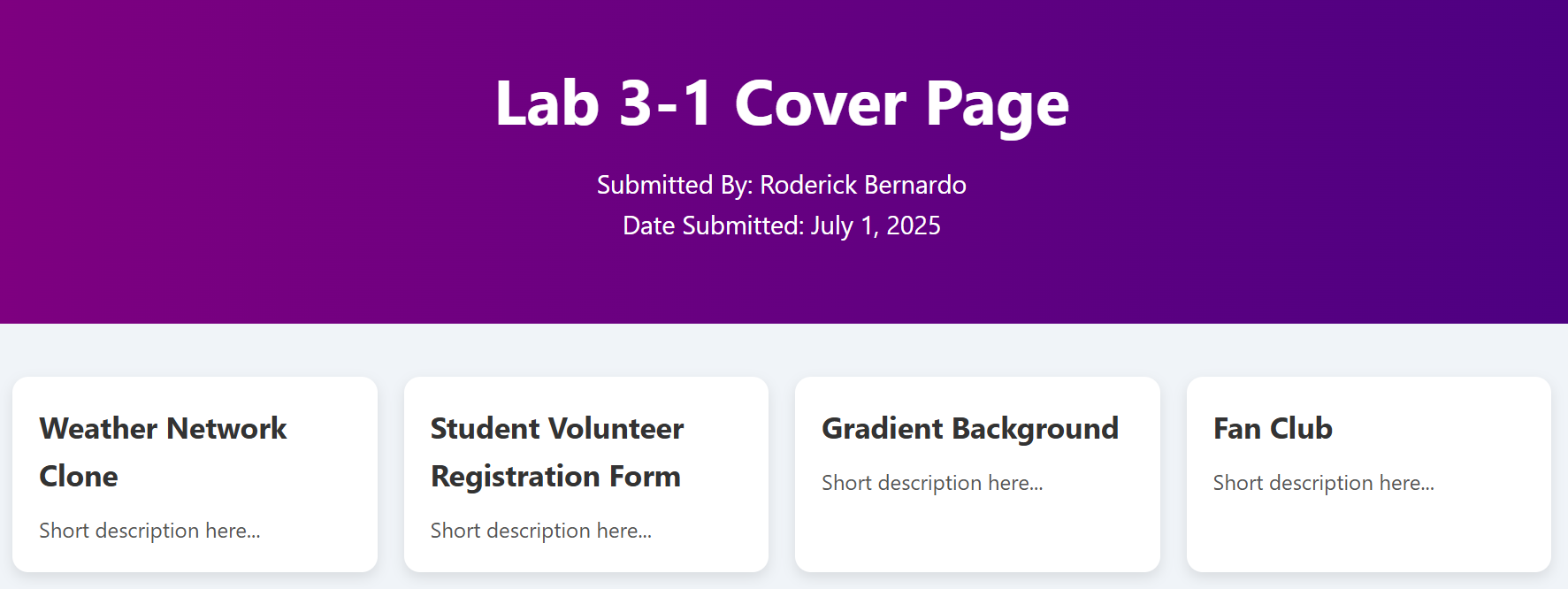
The image above is just a suggestion, feel free to come up with your own cover page design. The cover page should have links to the following apps:
-
7-Day Weather Forecast Page
-
Student Volunteer Registration Form
-
Gradient Background Page
-
Fan Club Web Page
I’m including the template in case you'd like to use this design. Feel free to modify it as you see fit.
-
Open Visual Studio Code and create a folder named: app.
-
Inside the app folder, create a file named: cover.html and copy the code below:
<!--
    Developer Name:
    Purpose:
-->

<!DOCTYPE html>
<html lang="en">
  <head>
    <meta charset="UTF-8" />
    <meta name="viewport" content="width=device-width, initial-scale=1.0" />
    <!-- Set the page title -->
    <title></title>
    <link rel="stylesheet" href="./style.css" />
  </head>
  <body>
    <header>
      <!-- Set the page heading text -->
      <h1></h1>
      <!-- Set the submitted by text -->
      <p></p>
      <!-- Set the date submitted -->
      <p></p>
    </header>

    <section class="card-grid">
      <!-- Card template start -->
      <div class="card">
        <!-- Set the link for the feature -->
        <a href="">
          <!-- Set the feature text -->
          <h3></h3>
          <!-- Set the feature description -->
          <p></p>
        </a>
      </div>
      <!-- Card template end -->

      <!-- Add more cards below -->
    </section>
  </body>
</html>
- Inside the app folder, create a file named: style.css and copy the code below:
/* Developer:  */
/* Purpose: */

* {
  /* The width and height you set on an element include the padding and border */
  box-sizing: border-box;
  /* This resets default margin and padding that browsers add to elements */
  margin: 0;
  padding: 0;
}

body {
  font-family: "Segoe UI", Tahoma, Geneva, Verdana, sans-serif;
  background: #f0f4f8;
  color: #333;
  line-height: 1.6; /* Controls the vertical spacing between lines of text. */
}

header {
  /* Linear gradient left to right purple to indigo */
  background: linear-gradient(to right, purple, indigo);
  color: white;
  padding: 60px 20px;
  text-align: center;
}

header h1 {
  font-size: 3rem;
  margin-bottom: 10px;
}

header p {
  font-size: 1.2rem;
  max-width: 600px;
  margin: 0 auto;
}

.card-grid {
  display: grid;
  /* Defines how the columns in a CSS Grid should be sized. */
  /* repeat() */
  /* Shorthand to dynamically repeat columns, otherwise you have to manually define */
  /* auto-fit */
  /* Tries to fit as many columns as possible into the container. */
  /* minmax(250px, 1fr) */
  /* Each column will be at least 250px wide, but can grow up to fill the remaining space. */
  /* 1fr means "one fraction of the available space", which means columns grow equally. */
  grid-template-columns: repeat(auto-fit, minmax(250px, 1fr));
  gap: 20px;
  padding: 40px 20px;
  max-width: 1200px;
  margin: 0 auto;
}

.card {
  background: white;
  border-radius: 12px;
  box-shadow: 0 4px 10px rgba(0, 0, 0, 0.1);
  padding: 20px;
  cursor: pointer;
  transition: transform 0.3s ease, box-shadow 0.3s ease;
}

.card a {
  text-decoration: none;
  color: inherit;
}

/* Modify some of the properties when the mouse is over */
.card:hover {
  /* Move the element based on the X and Y offset */
  transform: translateX(-5px) translateY(-5px);
  /* Add a shadow to the element */
  box-shadow: 0 8px 16px rgba(0, 0, 0, 0.15);
}

.card h3 {
  font-size: 1.4rem;
  margin-bottom: 10px;
}

.card p {
  font-size: 1rem;
  color: #555;
}

/* Small Screens */
/* Adjust the font and padding */
@media (max-width: 600px) {
  header h1 {
    font-size: 2rem;
  }

  .card {
    padding: 15px;
  }
}
7-Day Weather Forecast Page
- Build a page based on the output below:
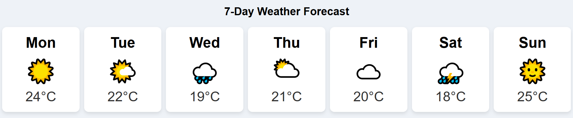
The image above is just a suggestion, feel free to come up with your own 7-Day weather forecast page design. I’m including 2 templates (flex and grid) in case you'd like to use this design. Feel free to modify it as you see fit.
-
Open Visual Studio Code and inside the app folder create a folder named: weather.
-
Inside the weather folder, create a file named: weather.html and copy the code below:
<!--
    Developer Name:
    Purpose:
-->

<!DOCTYPE html>
<html lang="en">
  <head>
    <meta charset="UTF-8" />
    <meta name="viewport" content="width=device-width, initial-scale=1.0" />
    <!-- Set the page title -->
    <title></title>
    <link rel="stylesheet" href="./style.css" />
  </head>
  <body>
    <!-- Set the page heading text -->
    <h2></h2>

    <!-- Set the class of this div to weather-container -->
    <div>
      <!-- Card template start -->
      <!-- Set the class of this div to day-card -->
      <div class="day-card">
        <!-- Set the class of this div to day-name -->
        <!-- Set the day text -->
        <div class="day-name"></div>
        <!-- Set the class of this div to weather-container -->
        <!-- Choose the appropriate icon for this -->
        <!-- ☀️ 🌤️ 🌧️ ⛅ ☁️ ⛈️ 🌞 -->
        <div class="icon"></div>
        <!-- Set the class of this div to weather-container -->
        <!-- Set the temperture value and copy the celsius symbol °C -->
        <div class="temp"></div>
      </div>
      <!-- Card template end -->

      <!-- Add additional cards as needed -->
    </div>
  </body>
</html>
- Inside the weather folder, create a file named: style.css. You can either try Flexbox Template CSS or Grid Template CSS:
Flexbox Template CSS
/* Developer:  */
/* Purpose: */

body {
  text-align: center;
  font-family: Arial, sans-serif;
  background: #eef2f7;
  padding: 10px;
}

.weather-container {
  /* Use flexbox */
  display: flex;
  flex-wrap: wrap;
  gap: 10px;
  justify-content: space-between;
  align-items: stretch;
}

.day-card {
  flex: 1 0 120px;
  background: white;
  border-radius: 10px;
  box-shadow: 0 4px 8px rgba(0, 0, 0, 0.1);
  padding: 16px;
  text-align: center;
  transition: transform 0.2s ease;
}

.day-card:hover {
  transform: scale(1.05);
}

.day-name {
  font-weight: bold;
  font-size: 2rem;
  margin-bottom: 8px;
}

.icon {
  font-size: 50px;
  margin: 8px 0;
}

.temp {
  font-size: 30px;
  color: #333;
}
Grid Template CSS
/* Developer:  */
/* Purpose: */

body {
  text-align: center;
  font-family: Arial, sans-serif;
  background: #eef2f7;
  padding: 10px;
}

.weather-container {
  /* Use grid */
  display: grid;
  grid-template-columns: repeat(auto-fit, minmax(120px, 1fr));
  gap: 10px;
  margin: auto;
}

.day-card {
  background: white;
  border-radius: 10px;
  box-shadow: 0 4px 8px rgba(0, 0, 0, 0.1);
  padding: 16px;
  text-align: center;
  transition: transform 0.2s ease;
}

.day-card:hover {
  transform: scale(1.05);
}

.day-name {
  font-weight: bold;
  font-size: 2rem;
  margin-bottom: 8px;
}

.icon {
  font-size: 50px;
  margin: 8px 0;
}

.temp {
  font-size: 30px;
  color: #333;
}
Student Volunteer Registration Form
- Build a page based on the output below:
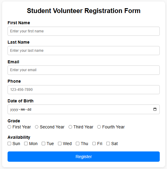
The image above is just a suggestion, feel free to come up with your own student volunteer registration form design. I’m including a template in case you'd like to use this design. Feel free to modify it as you see fit.
-
Open Visual Studio Code and inside the app folder create a folder named: registration.
-
Inside the registration folder, create a file named: registration.html and copy the code below:
<!--
    Developer Name:
    Purpose:
-->

<!DOCTYPE html>
<html lang="en">
  <head>
    <meta charset="UTF-8" />
    <meta name="viewport" content="width=device-width, initial-scale=1.0" />
    <!-- Set the page title -->
    <title></title>
    <link rel="stylesheet" href="./style.css" />
  </head>
  <body>
    <!--Set class attribute of this form to registration-form -->
    <!--Set action attribute of this form to htp://localhost:3000 -->
    <!--Set method attribute of this form to POST -->
    <form>
      <!--Set the page heading to Student Volunteer Registration Form -->
      <h2></h2>

      <!-- Text input template start -->
      <!-- Use this template if you need to use a text input box -->
      <!-- Set the class attribute of this div to form-group -->
      <div>
        <!-- Set the for attribute of this label to firstName -->
        <!-- Set the text of this label to First Name -->
        <label></label>
        <!-- Set the type attribute of this input to text -->
        <!-- Set the id attribute of this input to firstName -->
        <!-- Set the name attribute of this input to firstName -->
        <!-- Set the placeholder attribute of this input to Enter your first name -->
        <!-- Add a required attribute -->
        <input />
      </div>
      <!-- Text input template end -->

      <!-- Email input template start -->
      <!-- Use this template if you need to use an email input box -->
      <!-- Set the class attribute of this div to form-group -->
      <div>
        <!-- Set the for attribute of this label to email -->
        <!-- Set the text of this label to Email -->
        <label></label>
        <!-- Set the type attribute of this input to email -->
        <!-- Set the id attribute of this input to email -->
        <!-- Set the name attribute of this input to email -->
        <!-- Set the placeholder attribute of this input to Enter your email -->
        <!-- Add a required attribute -->
        <input />
      </div>
      <!-- Email input template end -->

      <!-- Phone input template start -->
      <!-- Use this template if you need to use a phone input box -->
      <!-- Set the class attribute of this div to form-group -->
      <div>
        <!-- Set the for attribute of this label to phone -->
        <!-- Set the text of this label to Phone -->
        <label></label>
        <!-- Set the type attribute of this input to tel -->
        <!-- Set the id attribute of this input to phone -->
        <!-- Set the name attribute of this input to phone -->
        <!-- Set the placeholder attribute of this input to 123-456-7890 -->
        <!-- Set the pattern attribute of this input to [0-9]{3}-[0-9]{3}-[0-9]{4} -->
        <!-- Add a required attribute -->
        <input />
      </div>
      <!-- Phone input template end -->

      <!-- Date input template start -->
      <!-- Use this template if you need to use a date input box -->
      <!-- Set the class attribute of this div form-group -->
      <div>
        <!-- Set the for attribute of this label to dateOfBirth -->
        <!-- Set the text of this label to Date of Birth -->
        <label></label>
        <!-- Set the type attribiute of this input to date -->
        <!-- Set the id attribiute of this input to dateOfBirth -->
        <!-- Set the name attribiute of this input to dateOfBirth -->
        <!-- Add a required attribute -->
        <input />
      </div>
      <!-- Date input template end -->

      <!-- Radio button input template start -->
      <!-- Use this template if you need to use a radio button input -->
      <!-- Set the class attribute of this div form-group -->
      <div class="form-group">
        <!-- Set the text of this label to Grade -->
        <label></label>
        <!-- Set the class of this div to inline-options -->
        <div>
          <!-- Set the type attribute of this input to radio -->
          <!-- Set the name attribute of this input to grade -->
          <!-- Set the value attribute of this input to first -->
          <!-- Add a required attribute -->
          <!-- Set the text of this label to Grade -->
          <label><input /></label>

          <!-- Add more options by copying the code above -->
          <!-- The type and name attributes should be the same as above -->
          <!-- The required attribute is only for the first instance, not need to for the rest of the options -->
          <!-- The value attribute of the input and text of the label should reflect the other option -->
        </div>
      </div>
      <!-- Radio button template end -->

      <!-- Checkbox input template start -->
      <!-- Use this template if you need to use a checkbox input -->
      <!-- Set the class attribute of this div form-group -->
      <div>
        <!-- Set the text of this label to Availability -->
        <label></label>
        <!-- Set the class of this div to inline-options -->
        <div>
          <!-- Set the type attribute of this input to checkbox -->
          <!-- Set the name attribute of this input to availability -->
          <!-- Set the value attribute of this input to Sunday -->
          <!-- Set the text of this label to Sun -->
          <label><input /></label>

          <!-- Add more options by copying the code above -->
          <!-- The type and name attributes should be the same as above -->
          <!-- The required attribute is only for the first instance, not need to for the rest of the options -->
          <!-- The value attribute of the input and text of the label should reflect the other option -->
        </div>
      </div>
      <!-- Radio button template end -->

      <!-- Set the class attribute of this div form-group -->
      <div>
        <!-- Set the type attribute of this button submit -->
        <!-- Set the text of this button Register -->
        <button type="submit">Register</button>
      </div>
    </form>
  </body>
</html>
- Inside the registration folder, create a file named: style.css and copy the code below:
/* Developer:  */
/* Purpose: */

* {
  /* The width and height you set on an element include the padding and border */
  box-sizing: border-box;
  /* This resets default margin and padding that browsers add to elements */
  margin: 0;
  padding: 0;
}

body {
  font-family: Arial, sans-serif;
  background: #f9f9f9;
  padding: 20px;
}

.registration-form {
  background: #fff;
  max-width: 600px;
  margin: auto;
  padding: 20px;
  border-radius: 10px;
  box-shadow: 0 2px 8px rgba(0, 0, 0, 0.1);
}

.registration-form h2 {
  text-align: center;
  margin-bottom: 20px;
}

.form-group {
  margin-bottom: 15px;
}

.form-group:last-child {
  margin-bottom: 0;
  text-align: center;
}

label {
  display: block;
  margin-bottom: 5px;
  font-weight: bold;
}

input[type="text"],
input[type="email"],
input[type="tel"],
input[type="date"] {
  padding: 8px;
  width: 100%;
  border-radius: 5px;
  border: 1px solid #ccc;
}

.inline-options {
  display: flex;
  flex-wrap: wrap;
  gap: 15px;
}

.inline-options label {
  display: flex;
  align-items: center;
  gap: 5px;
  font-weight: normal;
}

input:focus {
  border-color: #007bff;
  outline: none;
  background-color: #eef;
}

input:hover {
  border-color: #999;
}

button {
  width: 100%;
  background: #007bff;
  color: white;
  padding: 10px 20px;
  border: none;
  border-radius: 6px;
  cursor: pointer;
  font-size: 16px;
}

button:hover {
  background: #0056b3;
}
-
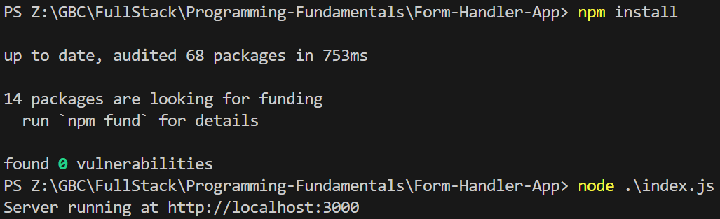
Download and extract the file Form-Handler-App.zip.
-
Open Visual Studio Code and open the extracted folder: Form-Handler-App.
-
Open the terminal and type the following:
npm install
node index.js
Ensure that the node app is running before you continue.
- Right click on registration.html and choose Open with Live Server. Test your form and ensure that you get a response from the server.
Gradient Background Page
- Build a page based on the output below:

The image above is just a suggestion, feel free to come up with your own gradient background page design. I’m including a template in case you'd like to use this design. Feel free to modify it as you see fit.
-
Open Visual Studio Code and inside the app folder create a folder named: gradient.
-
Inside the gradient folder, create a file named: gradient.html and copy the code below:
<!--
    Developer Name:
    Purpose:
-->

<!DOCTYPE html>
<html lang="en">
  <head>
    <meta charset="UTF-8" />
    <meta name="viewport" content="width=device-width, initial-scale=1.0" />
    <!-- Set the page title -->
    <title></title>
    <link rel="stylesheet" href="./style.css" />
  </head>
  <body>
    <main class="content">
      <!-- Set the page heading text -->
      <h1></h1>
      <p>
        <!-- Update *** and set to the direction specified in the parenthesis to the direction of used for the gradient on style.css -->
        The direction equal to: (***) was used to determine the gradient
        direction.
      </p>
      <p>
        <!-- Update ??? set the color specified in the parenthesis to list of the colors used for the gradient on style.css -->
        The following colors: (???) were used to create this gradient
        background.
      </p>
    </main>
  </body>
</html>
- Inside the gradient folder, create a file named: style.css and copy the code below:
/* Developer:  */
/* Purpose: */

body {
  margin: 0;
  height: 100vh; /* Use 100 percent of the horizontal view port */

  /* linear-gradient(direction, color-stop1, color-stop2, ...); */
  /* Feel free to choose one of the following direction values */
  /* to top */
  /* to bottom */
  /* to left  */
  /* to right */
  /* to top left */
  /* to top right */
  /* to bottom left */
  /* to bottom right */
  /* Add the list of colors are the direction definition */
  /* You can change the colors to any other hexadecimal or named colors */
  /* https://developer.mozilla.org/en-US/docs/Web/CSS/color */
  /* https://developer.mozilla.org/en-US/docs/Web/CSS/named-color */
  /* https://developer.mozilla.org/en-US/docs/Web/CSS/gradient/linear-gradient */
  background-image: linear-gradient(to right, red, blue, yellow);
  font-family: Arial, sans-serif;
  color: #fff; /* Text color */
}

.content {
  text-align: center;
  padding: 100px;
}
Fan Club Web Page
- Build a page based on the output below:
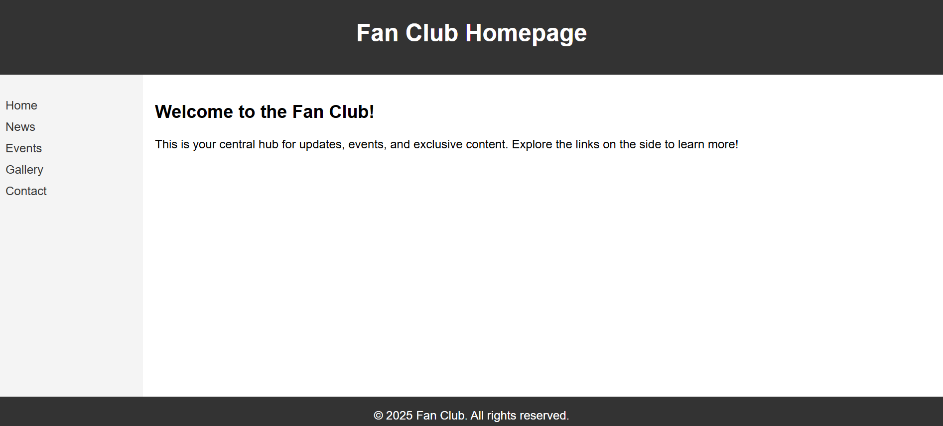
The image above is just a suggestion, feel free to come up with your own fan club web page design. I’m including a template in case you'd like to use this design. Feel free to modify it as you see fit.
-
Open Visual Studio Code and inside the app folder create a folder named: fanclub.
-
Inside the fanclub folder, create a file named: fanclub.html and copy the code below:
<!--
Developer Name:
Purpose:
-->
<!DOCTYPE html>
<html lang="en">
<head>
<meta charset="UTF-8" />
<meta name="viewport" content="width=device-width, initial-scale=1.0" />
<!-- Set the page title -->
<title></title>
<link rel="stylesheet" href="./style.css" />
</head>
<body>
<header>
<h1>Fan Club Homepage</h1>
</header>
<div class="container">
<nav>
<ul>
<li><a href="#">Home</a></li>
<li><a href="#">News</a></li>
<li><a href="#">Events</a></li>
<li><a href="#">Gallery</a></li>
<li><a href="#">Contact</a></li>
</ul>
</nav>
<main>
<h2>Welcome to the Fan Club!</h2>
<p>
This is your central hub for updates, events, and exclusive content.
Explore the links on the side to learn more!
</p>
</main>
</div>
<footer>© 2025 Fan Club. All rights reserved.</footer>
</body>
</html>
- Inside the fanclub folder, create a file named: style.css and copy the code below:
/* Developer:  */
/* Purpose: */

body {
  margin: 0;
  font-family: Arial, sans-serif;
  display: flex;
  flex-direction: column;
  height: 100vh;
}

header {
  background-color: #333;
  color: white;
  padding: 1rem;
  text-align: center;
}

footer {
  background-color: #333;
  color: white;
  padding: 1rem;
  text-align: center;
}

.container {
  flex: 1;
  display: flex;
}

nav {
  background-color: #f4f4f4;
  width: 200px;
  padding: 1rem;
  box-sizing: border-box;
}

nav ul {
  list-style: none;
  padding: 0;
}

nav li {
  margin-bottom: 10px;
}

nav a {
  text-decoration: none;
  color: #333;
}

main {
  padding: 1rem;
  box-sizing: border-box;
}

/* Smaller screens stack the divs like a column */
@media (max-width: 768px) {
  .container {
    flex-direction: column;
  }

  nav {
    width: 100%;
  }
}
- Creating a fan club web page is a great way to engage and connect with fans who share a common interest. Here are some elements you can include on your fan club web page to make it engaging and informative. Feel free to choose any features you like.
Welcome Message
A warm welcome message to visitors, expressing gratitude for their interest and support.
About the Fan Club
Provide a brief description of the fan club's purpose, mission, and what fans can expect by joining.
Membership Information
Details about how to become a member, including any fees or requirements.
Benefits of Membership
Outline the perks and benefits that members will receive. This could include access to exclusive content, early access to news or releases, special events, etc.
News and Updates
Regularly update the web page with news related to the subject of the fan club. This could be updates about the artist, team, or whatever the fan club is centered around.
Exclusive Content
Share content that is exclusively available to members, such as behind-the-scenes videos, interviews, or sneak peeks.
Events Calendar
Provide a schedule of upcoming events, like meetups, online chats, live streams, or conventions related to the subject.
Gallery
Showcase images and videos related to the subject, including fan art, photos from events, and promotional material.
Fan Contributions
Allow fans to submit their own content, like artwork, fan fiction, or cover songs, which can be featured on the website.
Social Media Integration
Include links to your fan club's social media profiles for easy access to additional content and community interaction.
Forum or Discussion Board
Create a space for fans to discuss topics related to the subject, share their thoughts, and connect with other members.
Merchandise Store
If applicable, provide a link to a store where fans can purchase official merchandise.
Fan Spotlights
Highlight dedicated and creative fans by featuring their work, stories, or contributions on the website.
Contact Information
Provide a way for fans to get in touch with the fan club's organizers for inquiries, suggestions, or feedback.
FAQ Section
Answer common questions that fans might have about the fan club, its activities, and membership.
Terms and Conditions
If there are any specific rules or guidelines for being a member, make sure to outline them clearly.
Newsletter Signup
Allow fans to subscribe to a newsletter for regular updates and news.
Ensure that the cover page have links to the following apps:
-
7-Day Weather Forecast Page
-
Student Volunteer Registration Form
-
Gradient Background Page
-
Fan Club Web Page
Submission
-
Create a folder named submit.
-
Copy the app folder to the submit folder.
-
Create a zip file of this folder.
-
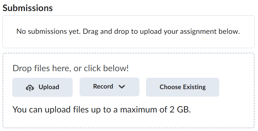
Navigate back to where the lab was originally downloaded, there should be a Submissions section (see below) where the zip file can be uploaded.